Revving Up Performance
Dashboards are growing in popularity as college administrators prepare for a new regime of accountability.
- By Rama Ramaswami
- 01/26/10
ACCOUNTABILITY, PERFORMANCE, stakeholders— this is the language of corporations, not academia. But thanks to a growing fascination with business intelligence dashboard technology, college administrators are fast learning the lexicon.
Dashboards are visual representations of key performance indicators (KPIs) that, in the style of the car dashboards they are named after, give the viewer a real-time “snapshot” of how an organization is doing. Long used in the business world, they allow top decision-makers to assess situations at a glance without having to decipher lengthy reports or spreadsheets.
Higher education administrators, however, haven’t been paying much attention to dashboards—until recently, when a number of colleges and universities began building them to monitor such critical areas as finances, facilities, enrollment, and student retention and graduation rates. “One of the things educators are starting to understand is the difference between operational reporting and strategic reporting,” says Graham Tracey, director of higher education services at business intelligence consulting firm ASR Analytics. “They’ve always struggled with basic things—who still owes the university money, how many students have applied today—and they’ve used a mix of standard and ad hoc reporting tools. But it’s the strategic side of the reporting that they’re waking up to now.”
A dashboard, Tracey says, offers a big-picture view of an institution’s ultimate objective as well as a way to measure progress toward it. “A dashboard really rolls up to the goals of the institution and its vision, mission, and strategy documents. A lot of these documents stem from initiatives that seem good but are not really measurable. The dashboard forces that measurement.”
Great Expectations
Large public university systems in particular have begun synthesizing data from their member institutions, for the first time bringing together information from a variety of sources and data warehouses in an easily understandable form. One of the most advanced tools is the accountability dashboard developed by Minnesota State Colleges and Universities, which comprises 30 two-year colleges and seven state universities. Craig Schoenecker, system director for research, is the chief architect of the dashboard. Using a combination of software from Hyperion (now owned by Oracle) and proprietary coding, Schoenecker developed the tool in 2008 and has since been refining it.
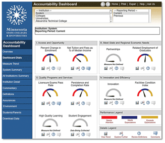
MNSCU’s accountability dashboard reports on 10 measures (such as condition of facilities and percentage change in enrollment) to monitor progress toward strategic goals.
Schoenecker says the dashboard grew out of an increasing emphasis that MNSCU’s Board of Trustees placed on relating performance to strategy. The accountability dashboard reports on 10 measures (such as condition of facilities, licensure exam pass rate, percentage change in enrollment, and student persistence and completion rate) that the board identified as the best indicators of whether the state system is meeting its strategic goals. Each individual institution, as well as the system as a whole, is assigned one of three performance ratings on each measure: 1) exceeds expectations, 2) meets expectations, and 3) needs attention.
“We’re providing a multifaceted tool that shows trends over time and across years,” Schoenecker says. “We offer both a visual and a tabular display, with documentation on the nature of the measures, sources of data, and context for interpreting performance.” Allowing users to interpret rather than just view performance is a unique aspect of the tool, he says, and one that is already showing positive results. “Individual institutions in our systems are focusing on their ‘needs attention’ measures, and digging in and changing them,” he states.
While the accountability dashboard is not yet interactive, it has that capability. Schoenecker says that one of MNSCU’s institutions has adapted it so that users can input their own parameters to generate customized dashboards. “We are developing drill-down tools for each of the measures,” he says. “Each of our colleges can get very specific data. Some will be available to the public, but there will also be a lot of internal information for our administrators to use.”
A Self-Service Model
For beleaguered college IT staffs, dashboard technology comes as a welcome relief, as the software has evolved to the point where users can access and interpret data on their own. This has been a key benefit for San Jacinto College (TX), a public community college with three campuses and several extension centers. About two years ago, Suzanne DeBlanc, the institution’s director of data management, found that her IT personnel were deluged with requests for custom reports. It was challenging and time-consuming to extract the necessary information from the college’s Sun- Gard Banner ERP system. Deciding that self-service was the way to go, DeBlanc’s team deployed WebFocus, a reporting system with graphical report-development and search engine capabilities. The system provides a variety of templates into which users can input their own parameters and create customized dashboards. They can compare enrollment figures from different years, for example, or find out how students were performing on each campus. They also can drill down for specifics on any category of information, such as which students needed financial aid.
“Reports that used to take the IT department 15-20 hours to complete can be run instantly by the user community,” says DeBlanc.
The dashboards also provide a level of detail that allows targeted decision-making. For example, San Jacinto College participates in initiatives such as Achieving the Dream, a national program to help community college students— especially those from underprivileged groups—succeed. Explains DeBlanc, “The dashboards help us to have data available for decision-makers about how certain developmentally challenged groups of students are doing, so we can offer courses to help them do better. It used to be that only research or IT people could draw this data.”
Measuring Employee Performance
Some of that information is now entering the personnel arena. In a climate of meager budgets and increasing enrollments, colleges are beginning to use dashboards to assess employee performance, including efficiency and productivity—factors that were not measured systematically in the past and could make academic hiring practices more rigorous. Ohio State University’s employee-measurement dashboard was one of three winners of the College and University Professional Association for Human Resources’ (CUPAHR) Sun- Gard Higher Education Innovation Awards last year, and wowed attendees at the 2009 CUPAHR conference.
Laura Gast, a senior systems manager at OSU who created the dashboard along with her colleague Kenneth Orr, points out that hard data is becoming the basis for all decisions in academia, including faculty hiring, compensation, and retirement. Before their first dashboard implementation, Gast and Orr were assigned to create a warehouse of faculty information, pulling together 10 years’ worth of demographic and salary data housed in several different databases and departments. “Once we did that, the next step was to show the data in a graphic format,” says Gast. Using Hyperion’s dashboard builder, she and her colleagues came up with a series of simple charts that allowed administrators to quickly assess faculty statistics and promotion and retirement trends—and factor them into strategic planning.
“As for productivity and accountability measures, we’re not there yet,” says Gast. But those are in the works, she adds, after she gathers more information about faculty research grants and teaching loads. “We do have plans to expand the data that are available, and we’re interested in predicting trends,” she says. “Right now the dashboard is restricted to faculty, but we’re creating an all-employee data warehouse and then an employee dashboard.”
Forecasting for the Future
For the moment, most campus dashboard developers have not tackled forecasting, but that’s also taking shape. At the University of Minnesota’s Veterinary Medical Center, Director of Informatics Laurel Schedin has just begun to experiment with iDashboards’ new Real-Time Analytics module, which allows projections based on live data feeds and userspecified parameters. A little more than two years ago, Schedin used iDashboards’ enterprise software to build dashboards that tracked such criteria as the number of incoming cases, students’ clinical competencies, faculty compliance with grading practices, and resource allocation. The new real-time module goes a step further by enabling “what if” scenarios, says Schedin. “You can actually ask, ‘What would happen to my lectures if I increased the number of students in each class?’ You can enter the parameters. You can figure out labor costs. You can dump everything into an Excel spreadsheet and do your own manipulation. The source data remain the same.”
For all its sophistication, though, dashboard technology works best when it remains behind the scenes. It’s possible to go overboard with the visual “bling” and defeat the very purpose of dashboards—simplicity. The high cost of most dashboard software (estimates are in the five figures for two to five users) makes it essential to use it with an eye to return on investment. In most cases, that means not wasting resources on creating flashy graphic displays. OSU’s Gast points out that dashboards are most effective when their design is uncluttered; a simple chart or graph may look elementary but contain a wealth of underlying data. OSU’s faculty dashboard “comes up as a dashboard, but with a couple of clicks it takes you to pivot tables that can be manipulated,” she says. “You can add other pieces of information; move the pivot table around; add fields or remove fields; drill down to the level of the individual faculty member.”
Tracey of ASR Analytics reminds college administrators that a dashboard is essentially a call to action. “Simplest is best,” he advises. “Don’t go nuts over the display. There is a disconnect between what people think they want and what they need. All you need is an alert to take action.”