Sustaining a Brand Over a Large Web Site
Keeping Cornell.edu updated and consistent is an ongoing project, complete with its own blog.
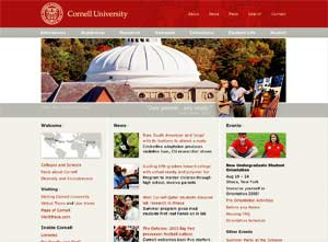
Cornell University (NY) is in the process of a fullscale,
four-year plan to redesign and rebrand its Web site (www.cornell.edu),
along with the rest of its communications means—even campus signage and
the sides of the university trucks. The entire Cornell community has been invited
to join in the conversation about the Web redesign via a dedicated site, complete
with a blog of dayto- day progress (web.cornell.edu/redesign/blog).
In fact, the blog has been very helpful to those leading the redesign effort,
according to Lisa Cameron-Norfleet, program manager in the Office of Web Communications.
She has direct responsibility for maintaining relations with the Web developers
across Cornell’s far-flung organizational map. “In the redesign
process, we have put up screen shots that we thought we were happy with, gotten
feedback, and realized that they didn’t work as well as wethought,”
she says. But judge for yourself how well Cornell’s branding techniques
maintain consistency across the five million pages that make up the university’s
site. We’ve spotlighted a few of the most salient features here.
Logo
and Colors
The introduction of an updated Cornell logo in October 2004 was the result
of a study that the university carried out with the help of design firm Chermayeff
& Geismar (www.cgnyc.com).
“The logo is a way to represent the university in a small, compact, but
powerful way,” explains Diane Kubarek, director of the Office of Web Communications.
The next natural step was to coordinate how the new logo would be rolled out
throughout Cornell.edu. “Cornell red” became just a touch darker
in the new logo. But individual designers are allowed to use black, gray, and
white versions as well.
Campaign Images
That’s what Cornell calls the
large images that dominate the home page and other major pages. They have been
a major topic of discussion on the blog and on other channels. “We talked
to people about what sorts of imagery were iconic to them, like the Clock Tower
or the rose window in Sage Chapel,” says Kubarek. “But we also wanted
to portray our diversity and richness, the amazing variety of programs and activities.
Special events like Dragon Day gave us a chance to do that.”
Stickers
or Cutouts
A motif repeated throughout the Cornell site is the contrast of up-close
pictures of individuals or small groups of students and faculty, pasted against
a background of scenics or panoramics. The design team calls these “stickers”
or “cutouts.” They help maintain a human scale and personal connection.
Meaningful Quotations
A quotation from the school’s founder, an alumnus,
or other person of note is a regular feature on many key pages of Cornell.edu.
These “guest appearances” strengthen the Cornell brand as an institution
of world consequence. They also provide diversion from the flood of more practical
information found on the Web site’s pages.