How to Revamp Your Campus Web Site for Recruitment
By turning its Web site into a recruitment tool, this small university lost traffic and gained applicants.
- By Dian Schaffhauser
- 10/04/12
For an institution of just under 2,300 students with a tiny Web site staff, Graceland University's approach to managing site content was typical of many small universities: Put in place a content management system (CMS) and delegate. Each department and school at the two-campus institution (with one site in Lamoni, IA and the other in Independence, MO) was responsible for addressing individual areas of the university Web site.

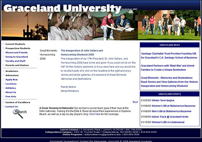
Graceland University's Web site in 2009, before the redesign |

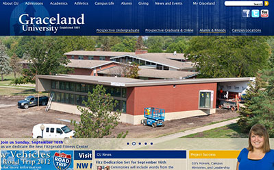
Graceland's Web site in 2012, after the redesign |
But with as many as 25 people across campus editing various pieces of the site, according to Steve Edwards, director of creative services, the Web site lacked a single authoritative voice. And the diversity of messaging posed conflicts when it came to recruiting new students. Who had the final word about what should appear on the home page? What campuswide content should be included on Facebook, YouTube, or Twitter? Confusing potential applicants was exactly the opposite of what needed to happen.
"We just didn't have a consistent voice across the site," Edwards recalls. "So you'd be on one side of the site and you'd have a very formal tone, and then you'd go to another side of the site and it'd be very flippant and conversational."
While the institution could have used its legacy CMS to enforce a strict approval process for more consistency, resources to manage that workflow were few. And it didn't really make sense to battle individual departments for control over their own messaging and content. Instead, Graceland chose to winnow down the public-facing site to focus on what people new to the university would want to know. Anything else would be maintained in separate Web sites.
In a somewhat drastic move, Graceland pushed anything unrelated to recruitment off the university's public Web site, took a major traffic hit as a result, and ended up doing a more effective job in attracting new applicants.
Redirecting Web Visitors Elsewhere
The evolution started when Graceland's Athletics program set up an independent Web site powered by SIDHelp, a hosted service that caters to college athletics programs. For between $2,000 and $2,695 a year, the college gets roster and schedule management, a scoreboard, fan polls, document management, integration with social networking sites, a mobile version of the site, and other features relevant to keeping fans informed about school sports.
With athletics peeled away from the university Web site, administrators were persuaded that the public-facing site should specifically target recruiting of new students. The university had come to the realization that the home page at graceland.edu couldn't be the "front door for everything," Edwards says.
Any Web site content serving current students or employees was moved into an intranet titled My Graceland, accessible by network name and password. The internal site is managed by Graceland's IT department using Jenzabar's Internet Campus Solution. Each office within the university is responsible for updating its own content within the intranet. Edwards' office provides graphics and modifies the web page style sheets so that there's "a resemblance to our public site."
Although it took a while for students to adapt to logging into My Graceland rather than going automatically through graceland.edu, the university forced the issue by moving grades, announcements, and other forms of must-read content into the pages of the intranet. (Both My Graceland and the athletics Web site are accessible via a link on the Graceland home page.)
Initially, the move generated a lot of calls to the help desk, which was caught unawares by the flood of questions. That, admits Edwards, was ultimately his fault. "There should have been a lot more communication and it didn't occur."
A New Content Management System
The shift to the use of an intranet removed "hundreds of pages" from the main Web site, Edwards says. But initially he didn't intend to cut out the existing CMS, which Graceland had been using for eight years.
A couple of years prior, Graceland had spent a "fair amount of money" updating to the latest version of its CMS software. "It was doing a fine job of serving pages and allowing workflow," Edwards says. "What it didn't let us do was rapidly alter the design of the site to respond to changes in the market or add new features." The CMS used a complicated combination of cascading style sheets (CSS) and Javascript that was beyond the programming abilities of in-house staff. So the university would end up spending several thousand dollars to have the vendor do the template updates.
When the time came for another site refresh, Edwards wasn't looking forward to the process.
He and his web designer began evaluating alternatives. Most CMSs were eliminated because of how complex and expensive they seemed to be. He was put off by the challenge of getting people retrained on a new content system. At the same time, Percussion Software contacted Edwards about CM1, its CMS. He took a look and was a bit intrigued, so he sat through a demonstration. There was something about it that seemed simpler to use than the other choices.
"The thing that really attracted me to it was the fact that we could change out the look of it as rapidly as we could write CSS," he recalls. The fonts, colors, layout of the pages, and other components of the Web site are all handled through CSS. "We were able to start building our templates immediately. We didn't have to deal with any complex programming."
"Just by manipulating the CSS, which is really relatively easy to do, you can completely optimize what you want your site to look like," Edwards explains. "So changing out templates is very simple, and it's very fast. Now when someone comes to us and asks us to add a column to the site, we can do it in minutes. Before, I'd have had to say no."
But it was the pricing that fully hooked him. "Budget is always a consideration, and [Percussion] came back with a really good price," he notes. "I could bring CM1 in, and my annual cost would be half of what it was before. That was a huge sales point."
The new CMS was installed in December 2010. Design work was done in May and June 2011; template-building took place in July. Buy-in and training among staff happened in July and August. The new site went live in September 2011.
Now, the focus on the home page is on prospective undergraduates, graduates, and online students. Themes promote new campus building dedications and "Project Success," a new marketing effort that profiles current students and alumni and shares "mini-stories" about how their Graceland experiences are helping them to be successful.
The images are large and dominate the page. Edwards hopes to switch out photos weekly, although the text will remain constant.
The university has begun putting more energy into search engine optimization and is looking into paid advertising through Google and Facebook. A mobile version of the public Web site is also on the agenda.
Proving the Point With Metrics
These days content for graceland.edu is created not by 25 people but by five: Edwards and his web designer, a person in the registrar's office, a staffer from the alumni and development office, and a representative from the admissions office. The marketing department controls the messaging.
Perhaps more importantly, the changes wrought by stripping out athletics and existing users from the public-facing Web site have had a major impact on Web site metrics.
Says Edwards, in March 2010, the site had 33,000 unique visitors. Seventy four percent were returning visitors. "So most of those were parents of athletes, students, faculty, employees--people who were constantly coming back to the site. Those weren't people we were recruiting."
By March 2011, when the athletics site was moved elsewhere, the count dropped to 27,600 unique visitors. About 69 percent were repeat visitors--students and faculty, primarily.
In March 2012, the site had 22,000 unique visitors. Of that 56 percent were repeat visitors.
Isn't that trending the wrong direction? "No," insists Edwards. "What that tells me is that I'm having fewer employees and students hitting my public site. They're hitting the My Graceland site." To phrase it differently, he notes, "Back in 2010, only 27 percent of my visitors were new. Now, 44 percent of my traffic is new visitors."
People are staying on the site longer, page visits are holding steady, and applications for admissions are up. "They're not making their final decision solely off the Web site, but it plays a huge role," he says.
About the Author
Dian Schaffhauser is a former senior contributing editor for 1105 Media's education publications THE Journal, Campus Technology and Spaces4Learning.