3 Ways to Revamp Your University Website
If your institution's website doesn't pull in students, it's time for a revamp. Here's how universities are reorganizing their web content, integrating enterprise applications, and adapting to mobile devices.
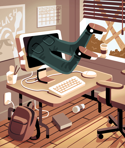
Illustration by Chi Birmingham |
Are your website's underpants showing? If your institution's site hasn't been refreshed for a while--if, for example, it still sports the same navigation from last century--the answer is probably yes, says Luke Wroblewski, CEO and cofounder of Input Factory, an internet startup focused on mobile design.
Wroblewski's message is straightforward: If your website navigation consists of a list of your college departments, you have allowed your organizational underpinnings to dictate the structure of your site. Instead, schools should invert that model and ask themselves, "What do people actually want from us? What are they trying to achieve and how are they trying to achieve it?"
"A shift like this changes everything," he says. "How you organize content, how you label things, and what you include. They all become different when you take that outside-in versus inside-out perspective."
CT spoke with four universities that have revamped their websites--reorganizing content, integrating enterprise applications, and adapting to the rapidly growing demand for mobile capability--all with the aim of being more relevant to students. Here are their best practices, starting with covering up those underpants.
1) Reorganize by Audience
By the time students return to school this fall, Park University (MO) will have completed an overhaul of the school's website. The changes include improving the navigation and integrating functionality from two Hobsons offerings, the Connect CRM constituent relationship management system and Retain, a retention tool.
To enhance navigation, the new site will feature tabs for different users: an alumni tab, a current students tab, an admissions tab, and so forth. In the sub-navigation within each tab, the audience paths can be further specialized: "Within our admissions area there's going to be a tab for freshmen and one for transfer students," reports Alan Liebrecht, associate vice president for enrollment management. "We have a big military student population, so there's a military tab, a tab for graduate students, and an international student tab."
In addition, Park is using Hobsons' VIP portals for prospective and current students. Students log into these personal microsites to get customized content based on information gathered through the CRM system. If a student's web activity indicates he is ready to apply for financial aid, for example, a link to the school's financial aid page is automatically added to the student's VIP portal. Similarly, if a student has expressed interest in a school sport or activity, his portal will display links to related content on the main Park website.
Park plans to use the Hobsons Retain product for more targeted messaging, identifying and communicating with students whose grades are slipping, who aren't attending classes, or who show signs of financial strain. While this communication often takes place via e-mail, it is supported by related content on the website.
Customizable content is also giving web users what they want at Adelphi University (NY), where the school's open source Liferay portal enables students and faculty to drag and drop sections, or portlets, on its website.
"If they don't want to read The New York Times, they can hide it and replace it with a sports section," says Scott Finkelstein, manager of web technologies at Adelphi. Using the same feature, users can personalize their views with relevant applications--such as the student gradebook--that sync to the portal.
|
CT Summer Spotlight
This month at Campus Technology 2013 (July 29-Aug. 1 in Boston), a series of conference sessions on mobile learning will explore the trends and implications of mobile in the business of education. Highlights include "When Mobile Learners Are the Teachers: Creating the University of Michigan Mobile Users Group" and "Designing Student Experiences With Mobile Technology: Apps for Active Learning."
|
2) Cater to Mobile Needs
American University (DC) has taken a strategic approach to the mobile web, doing extensive research and analysis to fine-tune its website for the specific needs of mobile users.
Following a big surge in mobile traffic to its website, the university launched a mobile strategy working group in summer 2011, recounts Francesco De Leo, director of web and emerging technologies and enterprise systems. The group researched the mobile solutions at other schools, established some best practices, and determined what existing content could be repurposed for mobile users. By November of that year, the group had a working prototype built on jQuery, a slim JavaScript library, and jQuery User Interface, a set of UI functionality that enables quick web design.
"The prototype enabled us to see how we could reutilize the structured data that we had on our content management system, on our SharePoint portal, and some of our legacy systems," De Leo says. The group worked intensively with representatives from the different campus constituencies--students, faculty, and administrators--to decide what content to prioritize for the mobile version of the site.
Applications with high demand across all three groups received priority, and the process to make them mobile-compatible began. "A lot had to do with how the data was structured and if it was portable--how well information would render on a mobile site rather than on a desktop version," adds De Leo.
The process paid off in a few strategic features of the mobile version of the site. "We were able to examine how much write access the students need to applications, and determine the proper level of permissions," De Leo says. If the data showed that students were likely to fill out a form using a mobile device, the form was made writable. In other cases, the site simply generates a reminder for students to fill out the form from a computer.
Based on customer feedback, American was also able to elevate the most popular portal links to the main screen, saving users from having to navigate through several layers of the site--a frustrating experience on a mobile device.
And American's big lesson? You don't need to be on the bleeding edge. Although many universities developed mobile strategies sooner than American, De Leo believes his institution benefited from waiting: More features were added to HTML5, and administrators didn't struggle to decide between creating a mobile app and a web app.
"If you look at our site, it looks like a mobile app," explains De Leo. "When the page loads, you have pagination like on an iPhone. You can create preferences and a cookie to remember them. So it's jQuery and HTML5 within our CMS." In De Leo's opinion, it's just a matter of time before HTML5 enables the kind of interaction with the phone's features, like camera or location capabilities, that is currently available only in native apps.
3) Be Responsive
"Students aren't using their mobile phones just because they're mobile phones," says Christopher Ward, assistant director of Enterprise Systems and Services at Kennesaw State University (GA). "Today they use them no differently than they do a regular computer. When students come to Kennesaw's site, they don't want just 1/20th of what they can get on the desktop version--they want the whole thing."
To meet this challenge, Ward and his Kennesaw colleagues determined that they needed to create responsive sites--sites that detect the type of device and optimize the way the content is displayed. "If I come to a page on a regular desktop, it looks like our regular site," explains Ward. "If I come on a mobile phone, we still have the same content, it's just formatted better for the device size." This approach, based on media queries in the CSS, works across all devices.
"As long as the device has got a browser, the content is rendered correctly," Ward points out. Kennesaw has added 10-15 large-scale responsive sites for admissions, financial aid, and online learning, among others.
Even as Ward and his team worked hard to make the school's web content render properly regardless of the device, they realized that the content itself could use a good scrubbing. The Admissions site, for example, had thousands of pages of HTML accumulated over eight years. "We asked Admissions, 'Do you really need 30 points of navigation? Can you get it down to 10?'" Ward recalls.
But Ward encourages schools to look beyond simply editing their old content to the possibilities of multimedia. Paragraphs and paragraphs of text, for example, might be replaced by a 45-second video. "There's a higher probability that people are going to be excited about it," Ward points out. "It's more shareable--something to show Mom and Dad."
|
Designing for Mobile First
"Mobile first" is the evangelizing message of Input Factory CEO Luke Wroblewski: the notion that organizations should design sites for mobile devices first, and then create their standard sites based on the mobile ones. He has spoken at various conferences about the topic--some recordings of his talks are available on his website, and worth a look. He even wrote a book by the same name.
"Designing for mobile forces us to think of anyone/anywhere use cases, because these devices are always with us," says Wroblewski. "When you start to frame thinking around that, you naturally gravitate toward use cases that are real world."
Some other benefits of the mobile-first approach:
- You meet the needs of a booming population of visitors to your site. By optimizing for the devices that visitors use, you make your site relevant.
- The constraints of mobile devices--smaller screens, varied bandwidth, less precise inputs (finger press instead of mouse click)--mean development teams must focus and simplify. "If we can deliver only five things, what are the most important five things?" Wroblewski asks.
- You can take advantage of mobile capabilities not available in a laptop or desktop, such as a built-in camera, microphone, or gyroscope. "All these technologies allow you to innovate," Wroblewski says. "What can we do differently if we know somebody's location within 10 meters? How can we do things differently knowing they have a camera?" The University of Notre Dame (IN) rose to this challenge, for example, by creating an interactive campus tour that takes advantage of the device's location technology to tell campus visitors where they are, what they're seeing, and why it's of interest.
A good example of a university that pursued a mobile-first approach during its website redesign is West Virginia University. Resources that users might need repeatedly--a campus map, application forms, course lists, and the academic calendar--stayed. Nice-to-have elements that might be viewed only once were axed, including campus slide shows, press releases, a letter from the president, and a statement of the school's philosophy.
It's a trend that seems to have legs. EBay, Google, and PayPal all recently declared a mobile-first agenda, Wroblewski says. Universities should take note.
|
About the Author
Michelle Fredette is a freelance writer who splits her time between Portland, OR, and Seattle.