IT Development
How User-Centered Design Improves the Student Experience
In a recent redesign of the University of Washington's MyUW student portal, listening to users was an essential part of the design process. Here's how MyUW provides dynamic, timely content to meet student needs, and what developers learned along the way.
- By Heidi Stahl, Karin Roberts, William Washington
- 05/23/19
At the University of Washington, the central student portal, MyUW, is an integral part of the student experience. It's the primary conduit for much of the information students regularly use to navigate the UW — from tuition balances, to course registration details, to e-mail, to course websites. On the first day of autumn quarter 2018, for instance, MyUW saw over 206,000 sessions from nearly 40,000 students, and the total number of student sessions for Autumn 2018 topped 1.84 million. While all members of the UW community use MyUW, students account for more than half of its users.
Eleven years after MyUW's initial 2000 launch, it was time for a redesign. Prompted by aging technology and an institutional imperative to improve the student experience, designers and engineers in UW's Information Technology group engaged in an iterative design process informed by a panoply of user research methods. The team took a service that had been created with an organizational focus and re-created it to focus instead on users — primarily students.
With the redesign, rather than viewing content grouped by organizational silos, students now see varied, relevant content highlighted throughout the quarter, based on the results of user studies about their informational needs. Links to disparate campus accounts (housing, dining, libraries, etc.), have been replaced by a summary of student account statuses. First-year students, transfer students and continuing students are shown articles about resources to help them navigate their particular challenges (also discovered through user research), with fresh articles displayed every week.
Ultimately, our project illustrates not only the importance of designing for the user but the availability and potential simplicity of a user-centric approach (for any tool or service), including for those institutions that lack a dedicated user research team.
Early Beginnings
When MyUW was born, internet search was in its infancy. MyUW's creators recognized that the UW intranet offered many useful resources for students and employees, but that people had difficulty finding them. MyUW was first built to provide a single entry point to important university services, freeing people from having to navigate to (and remember how to find) important resources.
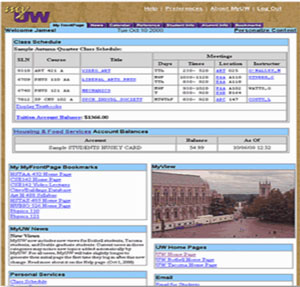
MyFrontPage, MyUW 2000
The original design of MyUW, therefore, presented an array of links organized into categories. Because personalization was important, MyUW organized resources based on a user's affiliation with the institution (e.g., student, instructor, staff, alumni). In one of the few dynamic areas of the portal, students saw personalized data: their course schedule and tuition balance.
Customization, in the form of users collecting and saving bookmarks and rearranging the layout of content, was also a feature of the early MyUW. But over time, users evolved from that cumbersome practice toward a reliance on powerful search engines. Users also came to expect modern web applications to be "smarter." Instead of wading through information, users want websites to show them useful and relevant information based on known data about their identities and behaviors. The new MyUW strives to meet today's user expectations.
The original MyUW was also very much of its time in that its design reflected the interests of stakeholders rather than end users. Many organizations across the university provided links to include in MyUW, resulting in a design that reflected organizational structure, with links presented based on the group that provided them, rather than how or when a user might best take advantage of that information. A further weakness of the legacy MyUW was the absence of dynamic content. Though MyUW provided a platform for content, few campus developers built channels to feed MyUW dynamic information.
Thus, a top priority of the redesign process was to move from a design that reflected the desires of information owners to a design that catered to user needs by providing personal and timely information.
Listening to Students
As the MyUW team started addressing the changing online landscape in 2011, they
began with users.
First, the team undertook a formal user research study with students, as part of an initiative sponsored by the UW Office of the Provost on improving the student experience. The user research team employed a number of methods across several studies: focus groups (by class level), one-on-one interviews, a survey, a 12-week diary study, "guerilla" usability studies (quick research that takes one to two days to plan and execute), and formative studies with users trying out early concept prototypes built in HTML. Each research method complemented the others, helping the team to understand different aspects of the user experience, answer different questions, and test assumptions.
For instance, focus groups and interviews provided insight into the users' larger goals, and what they were coming to MyUW to accomplish, as well as their challenges in accomplishing their goals. Surveys were useful in validating, quantifying and prioritizing the findings from interviews. The 12-week diary study brought into focus the predictable, reliable content needs of students for each quarter, and clarified student goals and the ways they use information available on MyUW. In total, 57 students participated in the studies (30 in the focus groups, 15 in the interviews, and 12 in the diary study) and more than 400 responded to the survey.
Findings
Each user research area revealed a number of insights for the project:
Focus groups. In focus groups, students described an experience of information overload when trying to use MyUW, due to the sheer number of links available. ("MyFrontPage," one of the most highly visited pages on MyUW with over 10 million pageviews per quarter, featured 36 links; "Academics," another highly visited page, featured 52 links.) The research team learned that it could take up to two years for students simply to figure out how to find the information they needed. Students also reported relying extensively upon search — even though the necessary links were there on the page. Above all, students reported that they wanted a mobile-friendly version of the portal; a majority of students reported accessing MyUW from their mobile devices.
Log data. In addition to doing studies with users, researchers analyzed MyUW log data to understand how the legacy MyUW was being used and by whom. At the start of the project, log data was examined to see which links users were clicking. Researchers discovered that despite the nearly 400 links on MyUW (spread across 10 tabbed pages), only a handful were heavily used. And many, many links were used by very few people.
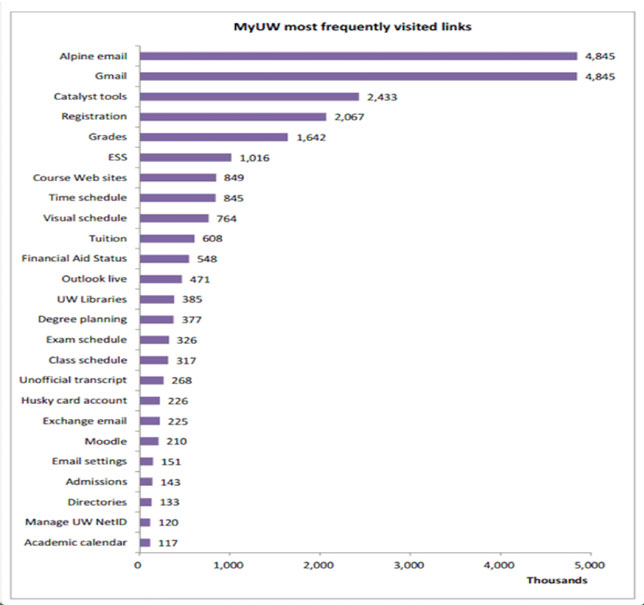
The long tail of frequently visited links
"The log data showed a really long tail, so we knew we weren't doing something right," said William Washington, MyUW product owner. Log data analysis also showed that users weren't using the navigation features to get around in MyUW. Despite the presence of tabs marking areas such as Academics, Calendar and Alumni, users relied upon the Search function to find their way around the site.
The usage patterns reflected in the log data were important for beginning to understand and prioritize user needs. Students tend to access a small subset of MyUW content, but what they do use, they use frequently, such as e-mail, registration information, their Husky Card accounts and class schedule.
Survey and diary study. Subsequent user research, including a survey of more than 400 students and an innovative diary study, helped the team to develop the vision and value statement for the new MyUW. The survey asked students to prioritize new and existing features for MyUW, to help the team understand what they valued most. Students wanted the MyUW team to:
- Make MyUW easier to navigate;
- Increase the personal content shown;
- Create a mobile version of MyUW;
- Reduce the amount of text on the screen;
- Make MyUW more visually pleasing; and
- Reduce the amount of general content.
Once the team had analyzed the survey data, the diary study allowed the research to focus on a smaller group of students in order to better understand their daily information-seeking behaviors and tool use, as well as their quarterly workflows.
Four groups of students participated in the diary study, logging tasks from 6 a.m. to midnight for three weeks, including the websites or tools they encountered. The data gathered provided a picture of what students were trying to accomplish over the course of a quarter, what information they need to support activities that move them toward their goals, and how students try to accomplish their goals on a day-to-day basis and over time.
The diary study provided insight that would become foundational to future designs of MyUW. Although students differ in many ways — their pursuits, their dreams, their work and study styles — their goals and work are date-driven and follow a predictable pattern each and every quarter. During specific weeks of the quarter, students are engaged in and concerned with specific tasks:
- Weeks 1-2: Checking tuition balance, finding classrooms, learning their class schedule, buying textbooks.
- Week 3: Checking course websites.
- Week 5: Preparing to register for next quarter's classes.
- Week 6: Registering for next quarter's classes.
- Week 7: Continuing to refine their registration by adjusting their class schedule.
- Week 10: Checking their final exam schedule.
- Week 11: Checking final grades.
This predictable pattern was essential in designing a MyUW that would help students complete tasks and accomplish their goals.
Articulating the Vision and Mission
From this wide array of user research (focus groups, log data, survey and diary study), as well as MyUW usage data, the team articulated a clear vision for the new MyUW, based on user needs: to provide personal, timely, relevant information and resources to help users conduct their work with the university. Further, MyUW would provide triggers for taking action, provide personalized and contextualized information, consolidate all critical information, and span contexts that students operate in, such as different affiliations, tools and activities (e.g., applying to the university, finding housing, enrolling in courses, completing coursework, creating and managing an academic plan, socializing, finding employment and so on).
The mission of the new MyUW is to provide actionable information and to direct users to the tools they need to accomplish their work. In the case of students, that meant creating a MyUW that would help them accomplish the tasks that would lead to achieving their academic goals. Personalized content from multiple systems would be highlighted when relevant: for example, in the early weeks of the quarter, pre-registration and registration information. Behind the relevant content, all content would be available to users at all times.
Mobile-First Development
Having taken the time to get to know users' challenges, goals, workflows and desires, the team was ready to begin developing the new MyUW. Due to the increasing usage of mobile devices and students' reported preference for mobile access, the team began by creating a mobile MyUW. The mobile version (a mobile web app) focused on supporting the quarterly timeline of students, promoting personal, relevant, timely information that students need in order to complete tasks at various points throughout the quarter. The goal was to feature information that would trigger actions students could take at a specific point in time, such as meeting deadlines for financial aid. The mobile version also provided links to complete workflows in other systems (e.g., MyPlan, the UW's academic planning tool). The first mobile version of MyUW also included features that students reported as high priorities: finding course information, e-mailing instructors, locating their classrooms on a map, finding and purchasing required textbooks, and accessing course websites.
After release, members of the team did a quick guerilla usability study, observing five students using the first mobile version on their phones. The first effort was not a home run. While visually pleasing, the first screen featured a list of a student's current courses, which the user had to click through in order to find additional information and to complete tasks. Some useful information that the old collection of links had exposed was now inadvertently hidden. Students already knew what courses they were taking; the information that they sought was hidden behind menus. Many would go immediately from the mobile version to the full, web-based site looking for what they needed, seeing the mobile version as an unnecessary extra step before getting to the information they sought.
With that feedback, the MyUW team returned to the drawing board to create a significant redesign that focused on content first, navigation second, adding additional features and content, and iteratively releasing updates. To help students address the challenges of time management, the subsequent design:
- Provided timely information to serve as a trigger for action;
- Highlighted critical notices that students could address first;
- Curated resources to make them easier to find;
- Brought forward personal information and data from other systems to eliminate the need to click through and seek information on other sites; and
- Grouped together resources that supported a workflow to ease completion of tasks and goals.
The new content model presented information on cards that were dynamically re-ordered depending on the week of the quarter.
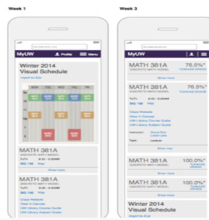
New content model with card ordering
Content was highlighted, then hidden when no longer relevant. Critical content was always visible and accessible. A usability test with an HTML prototype validated that this scrolling-heavy design met student needs and presented no usability barriers. Student reaction to the card ordering was generally positive. With that approval from users, the team proceeded to build out the new card model.
Subsequent releases of the mobile version added more content — account balances, final exam schedules, prices on required textbooks, and information about upcoming quarters. The mobile version also allows students to follow links to do further work in other systems (e.g., MyPlan). The team continued to iterate and eventually developed a fully featured version for mobile. That was then scaled for desktop use to replace the legacy MyUW (for students, that is; replacements to meet the specific workflows of instructors and staff would come later).
Today, MyUW supports students, instructors and staff with personal and timely content. Users log more than 2 million sessions each month. In addition to student content, MyUW supports quarterly instructor workflows with a teaching schedule, easy access to key teaching and learning tools, and an innovative course dashboard with data to help instructors prepare to teach and engage students. We continue to evolve MyUW to better support student needs, and will be soon undertaking development of native mobile apps with push notifications to students' mobile devices.
Steal This Work, Please
Our hope in sharing this case study is that others will leverage the findings and the research process for their own student-centered projects. Although your institution may not be building a student portal, or your unit may not have staff trained in user experience research, you can still take advantage of the work described here to build user-centric student tools or services. Here are four key takeaways:
Findings. While the research that informed the MyUW redesign was conducted with particular students at a particular institution, we can safely assume that the findings generally reflect student patterns. Students at any institution will have goals that are date- and time-driven. Their workflows will follow a predictable pattern, whether the academic term is a quarter or a semester. They will likely find time-management challenging and will benefit from technology that helps them focus on and complete the key tasks of the moment. And students everywhere will benefit from personalized content and mobile access.
Process. At different times in a project, varied user research methodologies are appropriate. Each methodology helps answer different questions.
- Focus groups and interviews helped us understand large goals and the challenge of reaching those, and provided a rich view of the user experience.
- Following up with a survey allowed the team to validate, quantify and prioritize the interview findings.
- Diary study was innovative and helpful in understanding the predictable, reliable content/information needs of students for each quarter. The diary study helped us understand student goals and information use patterns.
- Getting feedback doesn't have to be cumbersome. Lightweight guerilla usability studies, with a handful of students and quick HTML prototypes, helped to quickly validate design directions.
Vision and mission. Articulating the vision and mission was also a crucial piece of our work. Teams are often tempted to skip this step, assuming that it's a time-consuming non-essential. However, developing a clear vision and mission gives designers, researchers and engineers touchstones they can use to evaluate their ongoing work, ensuring that their efforts continually align with an agreed-upon direction based on findings from user research. Taking the time to establish reference points of vision and mission can actually save time further down the development path.
Listening to the user. Most important of all, when building for students, include the student voice. When planning for a new tool, even if you are going to choose a vendor product, including the student voice is critical to the decision process. Students are crucial but often invisible stakeholders; effort must be made to include their perspective, needs and goals when designing or choosing a product they'll be using.

