New Johns Hopkins Tracking Map Delves Deeper into U.S. COVID-19 Data
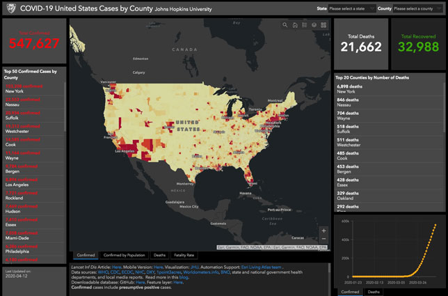
Screenshot of the JHU U.S. COVID-19 map as of April 13, 2020
Johns Hopkins University has launched a United States-specific COVID-19 tracking map with comprehensive county- and state-level data. The new resource complements the global COVID-19 map introduced by the institution earlier this year.
Among the information detailed in the new map, according to a news announcement:
- Density of the outbreak and its effect on counties;
- Localized stay-at-home policies and effective date;
- County-level confirmed cases and deaths compared to the state levels of each;
- State-level testing data;
- Race and ethnicity data for each county;
- Poverty rate for each county;
- Health insurance by type for each county;
- Number of residents per county in the highest risk age category 65+; and
- Hospital capacity data, baselines of licensed beds, staffed beds, and ICU beds
Johns Hopkins is providing the map "as a resource for media, policymakers and communities to view a collection of critical public health data in one online destination and better understand and track the COVID-19 pandemic in populations both large and small across the country," the university stated.
The U.S. map was created by the Johns Hopkins Centers for Civic Impact, with participation from the Applied Physics Laboratory, Johns Hopkins Bloomberg School of Public Health and Whiting School of Engineering, as well as technical support from ESRI and the JHU Sheridan Libraries.
About the Author
Rhea Kelly is editor in chief for Campus Technology, THE Journal, and Spaces4Learning. She can be reached at [email protected].