Research
How Course Web Design Impacts Student Engagement
When Instructure began analyzing the course designs for its higher ed customers, the LMS company discovered something about getting students to interact with the online elements of their courses.
- By Dian Schaffhauser
- 02/18/15

Shutterstock.com
Cloud-based applications have the advantage of generating lots of usage data that can give developers insights about how customers are using their products. Rarely, however, do companies share the data publicly. But that's exactly what Instructure did when it released an interesting infographic offering summary data from 387 colleges and universities that have used its learning management platform for at least two years.
Although the company shares all kinds of data points of interest in the compilation, what really stands out is the analysis Instructure offers on course Web site design. According to Jared Stein, vice president of the company's research and education division, the company enlisted experienced instructional designers to evaluate a number of course designs and rate the "navigational complexity" of those designs against a rubric.
Course Complexity and Depth
Stein and his team used the instructional designers' ratings as "training data" for a computer algorithm that could examine a course and determine its complexity rating based on the features included in the course, the number of tools used and the organization of content and activities. "We ended up with a five-point navigational complexity scale, where a one would be an absolutely simple course and a five would be the most complex course that you could build in Canvas," he said.
Then the company applied that model to all of the courses created by all the higher ed institutions using Canvas.
Broadly speaking, Instructure found that a course in Canvas starts off with fairly high level of navigational complexity — but then at about month nine, the courses become dramatically simpler for users to navigate. Stein thinks one cause for this is that when institutions start moving to Canvas, they're simply importing courses (and the associated navigational structure) from their previous LMS. "Any time you do a course migration, you're going to have to do some clean-up afterwards," he explained. Another possibility, he noted, is that the number of faculty using the new LMS grows over time, starting with the most experienced people; those who have never used the system before will tend to wait a while and then start off with a simpler course design.
Besides complexity, Stein also examined depth of courses, as defined by how frequently and consistently faculty used certain tools or features, such as discussion forums, content pages, files and assignments and quizzes.
The company took a sampling of courses and mapped them on a quadrant, with complexity on the y axis and depth on the x axis. While a large number of courses ended up being both simple to navigate and deep or rich with features, plenty of others fell elsewhere on the chart.
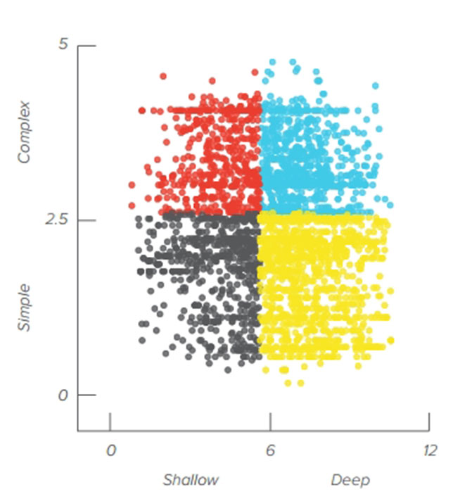
This distribution chart shows a sampling of courses placed by level of complexity and depth, pulled from colleges and universities that use Instructure's Canvas as their learning management platform.
The purpose of that exercise, Stein said, was "to see if we could create four really simple buckets that we could drop any course into" and figure out whether that had any meaning for student participation and, most especially, learning outcomes. As it happens, the company did find some correlations.
What Type of Course Design Do You Have?
The four "buckets" of course design were defined as follows:
- Complex and shallow;
- Complex and deep;
- Simple and shallow; and
- Simple and deep.
A complex and shallow course, for example, might make multiple LMS tools available but with inconsistent usage and inefficient navigation. The course home page might reference tools but not link to them. Discussion forums might exist, but without clear instructions for their use or how to get to them.
A complex and deep design, on the other hand, might use a lot of different activities throughout the course, but might lack a particular sequence to guide the student through the order in which the activities should be done.

This complex, deep design uses a lot of product features but without an obvious navigational route for the student to know what to do next.
A simple and shallow design might follow simple activity streams and the navigation bar might include minimal options. Courses that are mostly resource-sharing sites fall into this bucket.
A simple, deep design might lay out the course directly on the home page with a lot of different activities organized to give the student a clear indication about how to move through them. A given week's lessons page might include hyperlinks to each activity the student is supposed to do, and there's no question about what comes next.
This last design is Stein's personal favorite. "This reflects a lot of thought into how students can get from point A to point B most efficiently and with the least amount of hassle," he said. "One of the things that can be frustrating for anybody using a Web site is the sensation, 'I'm lost and I don't know where to go next.'" A simple, deep design "looks great, but it also is easy to navigate."

This simple, deep course design guides the student through the activities with obvious links to activities.
Impact on Student Outcomes
Student usage data supports Stein's assessment.
Across the four approaches to course Web design, the average rate of assignment submissions doesn't vary much; the bulk of students will use the LMS to submit assignments. But the level of student interaction in the discussion forums does vary widely. Whereas the complex, shallow design generates about four interactions per discussion, the simple designs do far better — 17 interactions per discussion in courses with simple, shallow designs and 12 in courses with simple, deep designs.
Beyond those findings, however, Instructure also discovered that design can really influence student outcomes. The more complex the navigation, for example, the lower the number of submissions, grades and interactivity. And the richer or deeper the feature usage, the greater the number of submissions, grades and interactivity.
Stein emphasized that the correlation between those factors was "very, very small," but "still significant" — "and it raises some super interesting questions."
Although the results are new and need additional research, he recommended that anybody considering course design changes look at navigational complexity first and foremost. "Determine if you can simplify your course design," he said, "to help students get the activity they need to get to faster."
With time, he noted, the company expects to refine its questions and its models to expose bigger correlations related to course design and student outcomes.
"The challenge for us is to figure out if these things actually matter, and if they do, how we can help people make better designs and simplify their course design so the technology doesn't get in the way of learning," Stein said. "That's what we're all about."

