Reading Between the Lines
What begins as a straightforward portal makeover for RIT ends up as a hard
look at usability and branding. Follow the numbers to see why.
When the Rochester Institute of Technology (NY) launched its
initiative to “spruce up” the institution’s Web portal, little
did administrators know the effort would eventually evolve into a systematic
review. But as the process moved forward, fundamental questions kept cropping
up: Why were some site visitors frustrated when they tried to navigate through
the site? Who was the primary audience? Most importantly, was the Web site communicating
the special character of RIT?
Study reveals surprises. The Institute decided to
commission a usability study of its existing site, recruiting actual prospective
students, a parent, and others to carry out scenarios. Among other things, notes
Diane Barbour, Chief Information Officer, “We found that we were using
terms that were familiar to us, but that many visitors didn’t understand—like
what it means to be a ‘matriculated’ student.” And administrators
soon realized that the navigation system had to be both simple to use, but able
to encompass a very complex university, providing visitors with a way to find
what they wanted among the 100,000-150,000 pages of content.
Inconsistency rules. One of the more interesting
realizations was that, contrary to more widely accepted practices, “We
decided it wasn’t necessary to have a consistent look and feel through
the entire depth of the site,” says David Hostetter, Director of Customer
Support Services. “Each college has a unique sense of itself, and we wanted
to preserve the trademark of each of those areas.”
Imagery supports strengths. Imagery turned out to
be a critical ingredient, and administrators felt that the nature of RIT justified
the use of high-tech Macromedia Flash animations. After all, explains Hostetter,
“We are an institute of technology, and a premier photography institution
in the world.”
Blazing brand. But the challenge that came to dominate
the redesign effort was: How can we make the Web site “scream the brand”
of RIT? Features such as “Career Center” and “Success Stories”
were added to emphasize how the Institute prepares students for life-long professional
careers (the special quality that RIT administrators believe sets it apart)
and to echo the aspirations of the students who select the school.
Assessment and re-examination of the Web site continues; messages evolve as
the needs of constituents change. RIT Information Technology Professor Evelyn
Rozanski and her students will be involved in future usability engineering studies
of the site, as will the Institute-wide Web Committee. “Our goal was to
develop a process, not just a new design,” says Hostetter.
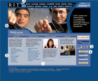
1 - Career Center and Success Stories.
(Rotating). How can you miss with an eye-catching visual and lead-in to a story
about a prominent RIT graduate, randomly selected from an archive every time
you visit the site? Research shows that students who choose RIT have definite
ideas about where they want their careers to go, and they want to see examples
of alumns who have made it in their fields. Career Center lets them match their
career plans with the right major, and informs them about employment prospects.
2 - For/About.
With drop-down menus, a lot of navigational options are compressed into a small
space, but they’re still uncluttered and easy to grasp. That’s because
the Web site captures the two main ways that the information on a site can be
organized: by who the visitor is (alumnus, prospective student, faculty, etc.),
or by what topic the visitor is interested in (“About”). The “About”
topics have drop-down menus that are activated by mouse roll-over, providing
an easy way to glimpse the next level of info available. Visitors don’t
have to click down and then back up to see what comes next.
3 - myRIT.
myRIT opens the door to a vast array of information available to insiders such
as current students, faculty, and staff. Students can check grades and register
for classes, powered by the campus information system. For fun and general information,
the Rochester weather forecast and live views from the RIT Web Cam invite visitors
to check out the weather for themselves, and site navigators can also view a calendar
of goings-on—even a dictionary word-of-the-day. (A recent example: “Flaneur:
loafer.”)
4 - Guest View.
The “Guest View” button lets non-community visitors
wander through non-confidential parts of the portal system and get a taste of
what the campus has to offer. (Many portal-equipped systems lack this courtesy
to visitors—or keep it tucked away.) RIT provides more powerful portal
accounts to prospective students and alumni.
5 - Campus Directory.
Ever been frustrated wandering around a school’s site
trying to find out how to contact somebody? Directory look-up information is
so basic that it ought to be found right at the top level—and it is at
RIT. If your institution has a policy against publishing such information on
the Web, consider telling a visitor that fact before he wastes time scouting
around. Then suggest other means your visitors can use to contact people at
your institution; a general number, at the very least.
6 - Flash Slide Show.
(Live rotation.) Yes, flash animations are controversial—so
much so that some users install software that disables Flash on every site they
visit. RIT came up with an effective compromise, however. This central illustration
d'es dissolve into a running slide show while the page is viewed. But far from
being just generic campus-brochure photography, each shot nails a specific personality
trait of RIT, and text is matched with the image to further illustrate the point.
What’s more, the Flash graphics are well-behaved; they stay within a frame
and don’t scoot distractingly around the page. Most importantly, the information
in the Flash slide show, while complementary to the page, is not essential for
navigation. And RIT provides a button that lets visitors turn the animation
off with a single click.