How U Arizona Uses Data to Stay on Top of COVID-19
This institution has found new uses for data analysis to guide campus leaders, improve user experiences and work with researchers.
- By Dian Schaffhauser
- 12/10/20
Like many other institutions, the University of Arizona dropped its "phased approach" plan for reintroducing more in-person courses at its Tucson campus. Now, the university is sitting in phase one until the COVID-19 infections and deaths go down in the state. That means students who have returned to campus are adhering to shelter-in-place recommendations. And faculty teaching classes that can be done online are encouraged to instruct that way. The few exceptions tend to be the same courses other colleges and universities are delivering face-to-face: those in lab sciences and healthcare. Even there, of course, students, faculty and staff are sticking with CDC recommendations on cleaning protocols and safety — wearing masks and maintaining physical distances.
But that doesn't mean the university is in a waiting pattern. As Lanita Collette, chief information security officer and deputy CIO at the university, explained in an interview played during .conf20, Splunk's recent customer conference, she and her team are using data to answer questions about online resource usage, improve user experiences and feed into researchers' need for information.
Collette joined the university in February 2017 from Flagstaff-based Northern Arizona University and immediately considered how to bring Splunk onto her new campus in ways that could both "inform [her] security practice" and scale its use "to answer a lot of other problems." Splunk produces software for capturing, indexing, searching, managing and analyzing real-time data, allowing users to do reporting, alerts, dashboards and data visualizations.
Collette said she believes her use of data has helped the university position itself to be "very well prepared for what happened with COVID." Here are three ways that has played out.
1) Answering Questions
Early on in the shift to remote instruction, leadership began asking a lot of questions: "How many students are accessing the learning management system?" "How well are our resources being consumed?"
Just as the technical staff had begun "down the path" of building dashboards to help administration get answers to their questions, Splunk introduced a dashboard application, Remote Work Insights, which provides insights on remote work in real time and historically, including:
- The number of people connected to the virtual private network;
- The number of active videoconferencing meetings; and
- The top application being accessed for the current day.
Almost immediately, the UA team pulled in data for their own RWI dashboard, enabling leadership to "make decisions about what else they might need to communicate, how they might need to engage with faculty who may not have been as accustomed to remote work practices and various things like that," Collette recalled. "We were very appreciative of that [release], because it reduced the amount of work my technical staff had to do by quite a bit."
The group also moved forward on a project to use anonymous data collected from wireless access points to help administrators understand how many people were on campus at any given time and where density was highest.
2) Improving Zoom Usage
Data has also been used to improve end users' experiences, specifically as it applies to the use of Zoom for videoconferencing, said Collette. As she noted, "Some people have pretty darned good experiences, [while others] have internet connectivity issues."
The team pulled data generated by Zoom into Splunk and correlated that with data about campus users. As she explained, "We can have alerts set for people who are having poor Zoom performance and see what areas of campus might be having issues." That includes Zoom use through the VPN or not, as well as on campus or off.
"That's helping us anticipate and assist people to improve the performance that that they are getting from Zoom," she said. "That's a kind of exciting new thing that we've just started doing that would be of interest to others who want to go that extra mile to really understand the user experience and interact with them to help improve that."
3) Feeding into the Researcher Appetite for Data
The use of data collection has also deepened the IT team's relationship with "a number of researchers" at UA, according to Collette.
"Researchers are data hungry," she said. "That is their bread and butter. That is where the innovation comes from. And the more data we can give them, the more they want, and really cool things begin to come out of that."
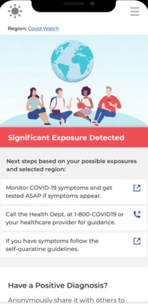
COVID Watch app
One big example of that was co-development of the COVID Watch app, which was the first exposure notification app to be broadly adopted by any college in the country. The app uses an anonymous process to collection information and alert users who may have come into contact with somebody who has COVID-19 and has self-reported it. The recipient of the notification won't know who the infected person is; just that exposure occurred. The app is available in the Apple App Store and on Google Play.
The program relies on a risk model built by a faculty member in UA's Department of Ecology and Evolutionary Biology. Joanna Masel developed a method to calculate the level of exposure risk by assessing the duration of exposure to and distance from an infected person, as well as at what point during the infection a user was exposed. According to the university, COVID Watch is the only app that actually uses this information to generate exposure notifications and individualized public health recommendations that better reflect real-life interactions.
Because the model allows for regional calibration, it's customizable to the corresponding local public health authority's current recommended precautions. Exposed users are offered region-specific resources upon notification, as well as information on public health guidelines determined by the area. Since the launch of COVID Watch, the university has promoted app use throughout the state.
The video featuring Collette, being interviewed by Juliana Vida, chief technical advisor for the Splunk's public sector business, is openly available on the Splunk website.
About the Author
Dian Schaffhauser is a former senior contributing editor for 1105 Media's education publications THE Journal, Campus Technology and Spaces4Learning.