Mapping Out the Future of Campus Maps
A recent question posed to the college and university webmasters list, UWEBD, asked the list subscribers to share their latest expertise and stories about the production and publication of campus maps. Not surprisingly, the ensuing discussion was enlightening. I'll share some of it here.
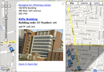
But first, one of the posters shared the new online campus map of Ohio State University and suggested that it may be a best-case exemplar. What do you think?
I like it. Using Google was a good idea. You can click on the little check box labeled "Food/Dining," and a bunch of little Google pin-bubbles pop up with a red circle and the letter "F" on it. And, it's difficult to know which is more important--you can locate wireless transmitters and parking. Okay, parking is definitely more important. And, of course, using Google means that the map your student or staffer or visitor is viewing doesn't end at whatever happens to be the campus edge.
Now, UWEBD is a busy and valuable online community and I figured there had to be someone on it from Ohio State who would chime in. After a few more posts I thought, well, I'll just give them a call. The map says it is maintained by university relations, so I called that office. A pleasant lady there transferred me to Ted Hattemer, Director of New Media in marketing communications within university relations.
Ted was willing to talk, so we did. (He's actually a UWEBD subscriber, but owing to the high traffic on that list, he had not had a chance yet to notice that his online map had been praised. He sort of promised me--I manage the UWEBD list--that he'd go read the thread and post some comments about how they got to their current map.)
The history of online maps at Ohio State University probably paralleled that of many campuses. First there was a fairly useless static thing. That was followed by (I hope I got this right.) a clickable map comprising a mosaic of .gif images that weren't really 3D but had a 3D look and feel to them.
Ted said that his department has always been blessed by the presence of very talented graphic designers who can do pretty much anything. He mentioned Jim Burgoon and Ellen Hoover, in particular, as being expert at design and also at the technical end of things. So, a couple of years ago, when he was contacted by a staffer from the libraries that had a side interest in the Google API, Jim and Ellen got to work and created what you now see.
He had looked, from time to time, at some of the various consulting firms that produce or assist campuses with map making, but his department's budget consisted solely of salaries and benefits for his staff, without much, if anything, in the way of an operating budget. That means that there really is no opportunity for outsourcing work like this to vendors.
Luckily, as we all know, colleges and universities benefit tremendously by the presence of creative and innovative people who stick around and work for less than they could get elsewhere in the market because of, among other things, the quality of life aspects related to working on a great college campus.
I asked Ted why his particular department had this responsibility, and it seemed as though it was a rather serendipitous thing. Most of the detailed drawings, plans, and hard data about the design and location of the parts of the campus' built environment are created and managed by the university architect's office. That is still where Ted's staff goes for authoritative data and images. But that office doesn't have the same responsibility as university relations for the interface with the external world.
Luckily, the decentralization that is common to many large universities with regard to IT has some advantages to compensate for the resulting departmental and budgetary miniaturization. Those tiny departments get into the habit of cross-departmental collaboration (the library, the architect's office), and they also have a lot of individual responsibility to prioritize and tackle projects of interest. As Ted put it, "People pretty much don't say 'Stop!' a lot."
I asked Ted where he and his staff look to find best practices in college and university work related to what they do. He mentioned Michigan, Penn State, and others, and had especially high praise for the UCLA Web folk, who he said just "do incredible stuff." But when his staff took on the Google map project for Ohio State, they weren't following anyone else's lead; it was a purely internally driven concept.
And well executed, I say. As a user, this is the kind of map I want to see when I virtually visit the campus. Of course, in addition to the Google map, the website has links to various drawn images, historical maps, and high-resolution printable maps. However, I suspect that most people who come looking for the campus map are quite satisfied with the Google map, especially when it displays the satellite image overlay and the various "filters" at the same time.
I should have asked him how it is decided and who decides what information gets into the various filters, but I didn't. I guess it's a no-brainer, though, that the Admissions Office and the Registrar each have their own little Google pin-bubble.