A Mobile Portal Designed for Accessibility First, Mobility Second
The portal at the University of Mississippi was recently redesigned to accommodate today's mobile devices, with an emphasis on responsiveness, accessibility and a user-friendly experience.
Since going live with its new myOleMiss portal design, the University of Mississippi has eliminated many of the issues that made the mobile experience at Ole Miss less than gratifying – and often frustrating.
"Before we tried to bring all of the separate applications under one portal, we were stuck in 2008," explained Robby Seitz, campus webmaster. Last year he and Harshul Sharma, system analyst, set out to build a new interface that would accommodate today's mobile devices, while maintaining the portal framework.
"Our portal layout was provided by SAP, with a little branding," said Seitz. "It was difficult — almost impossible — to use with a mobile device, and inaccessible to people needing screen readers. We had three layers of navigation. We were constantly looking in different places for menu items. The site index listed every application but was hard to search because it was alphabetical. We knew this was not the best way to lay everything out and were trying to fix it, but instructions were missing or unclear."
Solving these problems became the main goal for Seitz and Sharma. Like many schools, the University of Mississippi had to pull itself up by its bootstraps in order to meet the mobile challenge. The route Seitz and Sharma chose was a "back-to-the-basics" plan.
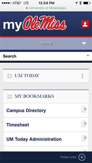
The myOleMiss mobile portal
"We started out by considering how to build a portal that has responsiveness and accessibility, and is user friendly," said Seitz. "It also had to take care of our whole population, which includes about 20,000 students and 3,000 faculty and staff — while simplifying the navigation process."
The challenge for Seitz and Sharma was to lay down the initial building blocks for Mercury Intermedia, the Nashville-based developers that built the university's mobile app. The developers were hired to revamp the portal with up-to-date design standards using HTML5 language and AJAX technology. While Seitz and Sharma were re-envisioning their portal navigation, Mercury Intermedia provided designs and interactions that were mobile-friendly and intuitive.
Working with Assistive Technology
During this process, Seitz and Sharma took a step that led them into the area of assistive technology, which includes any tool or device that an individual with a disability uses to perform a task that he or she could not otherwise do.
"Everyone wants you to start with mobile," Seitz explained. "Then you can increase features as you get to the larger desktop. We decided to go back another step and make sure our features worked for assistive technologies — then make it mobile. We started with the smallest device, made it work, then went on to add features."
Although mobile devices and assistive technologies are typically separate beasts, Seitz saw them as "two sides of the same coin." He added, "We're concerned with all people trying to access the page. If a person with a disability can do it, everyone can do it."
Seitz continued, "Until I thought this through, I hadn't read much about disabilities and assistive technology. It occurred to me that maybe this issue and the issues we were having were part of the same problem. We were overwhelmed with the number of things we had to think about in terms of a responsive device. At some point, it clicked that, in both cases, and even though they're not at all alike, we were just trying to get a device to work. In one case, it was a mobile device; in another, it was assistive technology."
Not assistive technology users themselves, Seitz and Sharma educated themselves about the types of accessibility concerns they should be aware of. For example, by making click/tap targets larger and predictable, they tried to accommodate people who have limited motor skills. By running their pages through WebAIM's WAVE tester, they learned what changes would be needed to improve screen reader performance.
Seitz and Sharma found it very helpful to get a handle on identifying all the types of devices through which their portal would be accessed. "It's important to recognize early on that, whatever your experience, it is most certainly not universal," explained Seitz. "Once you overcome this bias, you start thinking in broader terms." For example, he cautioned, don't assume that everyone can use a screen and a mouse — blind people use neither.
"Once we had enough of the new portal developed in a testing environment, we did involve a student with impaired vision to test it," Seitz said. "He reported that, for the first time, he was able to get into the portal and navigate between applications without assistance from someone else."
Four Steps to Success
Seitz and Sharma recommend these four steps to success when redesigning a portal to accommodate both assistive technology and advancements in mobile technology:
1) Start with your content. First, make a list of everything you plan to communicate through your site. For most pages, this will consist mostly of text and images. Determine how different parts of your content are related. Let this guide you in creating titles for your navigational menus.
2) Design for the smallest and most limited devices first. Remember "feature phones" from the early 2000s? Compared to today's smart phones, these devices don't offer many browser features, but that's exactly why you should build for them first. They don't render CSS or execute JavaScript. The most basic devices just show you text and images. You navigate links using a keypad. This very basic mobile experience is exactly what is needed to ensure that a site is accessible. In this sense, screen readers and feature phones are not that different. You start with an easy win on both fronts — accessibility and mobility.
3) Carefully add features to support smarter devices. Once you have tested the most reduced version of your page for both mobile friendliness and accessibility, consider what you would add to it for more capable devices. Ideally, you would know what features each device is capable of, but the most common improvements involve color, graphics and interactions. Add responsive design techniques so the page takes advantage of larger screen sizes. Consider what types of enhanced experience you might offer someone using a mouse.
4) Maintain the basic forms of interaction. Make sure that all the features you've just added haven't somehow complicated the most basic version of your page — the version that consisted of text and images and could be navigated using a keyboard. While supporting advanced features, you want to be sure that you haven't made the site less accessible for people with disabilities.
One of the reasons this simple procedure works, Seitz explained, is that many mobile users still have devices with fewer features. "Not everybody has an iPhone or Android. Trying to send all of the visual information available can slow things down dramatically. If the student is on campus, they can usually get through on WiFi. However, on game days, with 80,000 people on campus — or if a student happens to be studying abroad — bandwidth can be a huge issue."
"We're all trying to connect," said Sharma, "and we don't want hindrances. We don't want to overload pages with too much overhead in the way of file sizes, images, etc."
The Core Principles
"In 15 years," Seitz predicted, "we will have devices that haven't been conceived of yet. But these devices will likely continue to build upon the core principles of communication (text, images, semantic markup and interaction) that define current human-computer communication." He added that he already benefits from making the text on his iPhone larger, which can be considered an accessibility accommodation.
"In building Web sites that respond to these sorts of needs," Seitz concluded, "I'm responding to the needs of mobile users, and I'm also building the kind of Web that I can continue using into my old age."